
Project Overview
The Product
Bloomy is a US-based platform that specializes in floral orders. According to recent user research, online shopping has become increasingly popular for all types of purchases, including flowers. Therefore, Bloomy aims to provide users with a convenient and efficient way to purchase flowers through their online florist app.
The Problem
People want an easy and convenient way to order special flowers and gifts online. Lack of an online system to purchase flowers without visiting the store in person.
The Goal
Design an app for “Bloomy” that allows users to order and find the special flowers online easily.
Role
UX/UI Designer, UX Researcher ––
User Research, Persona, User Journey Map, User Flow, Wireframing, Prototyping, Usability Testing, Visual Design
Duration
10 weeks
Team
Individual
Time
Feb - May 2023
Content
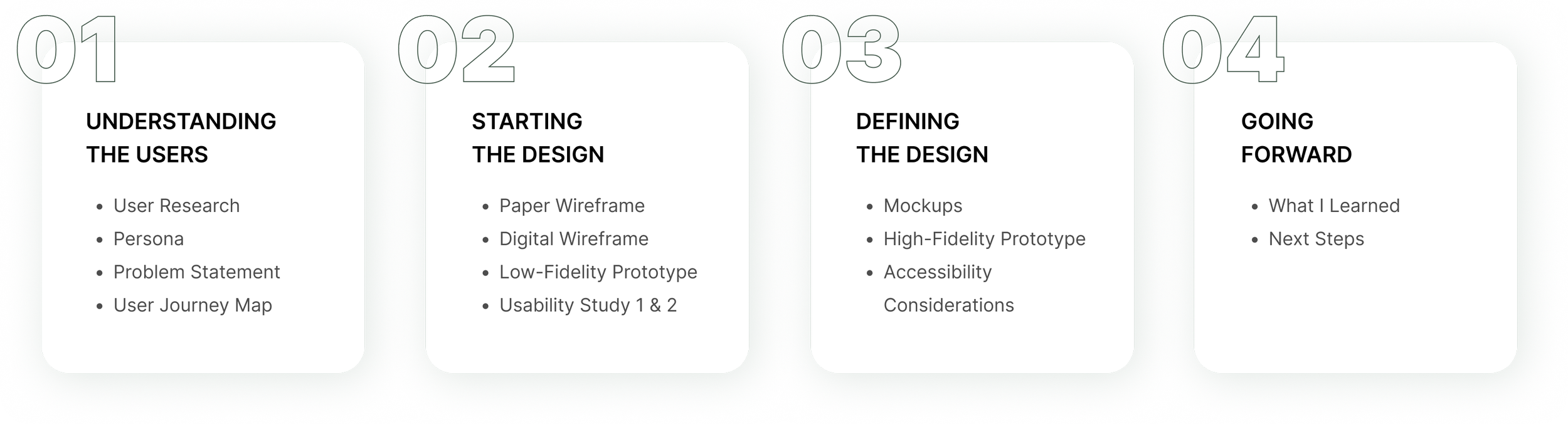
01. Understanding the Users
Understand the Users
01.1 - User Research
I conducted a survey called the "Florist Experiences Survey" to gather users' thoughts on purchasing flowers. The purpose was to better understand the users I am designing for and their needs. The survey consisted of 12 questions that focused on participants' past experiences with purchasing flowers.
Understand the Users
01.2 - Florist Experience Survey
A primary user group identified through research was people don’t have time to visit florist shop to purchase flowers and gifts in person. This user group confirmed initial assumptions about Bloomy’s customers. It also revealed that the convenience and a wider selection of flowers are causes people to prefer to use online orders.

Understand the Users
01.3 - Pain Points

Don’t Have Time
to Shop In-store
People don’t have time to go to flower shop and buy the flowers they need.

Lacks of Variety
Flowers
It is challenging to find specific flowers at a local flower shop due to a limited selection of available choices.

Quality Issue with
Online Products
It is hard to know whether the product you purchased will look the same as shown in the image.
Understand the Users
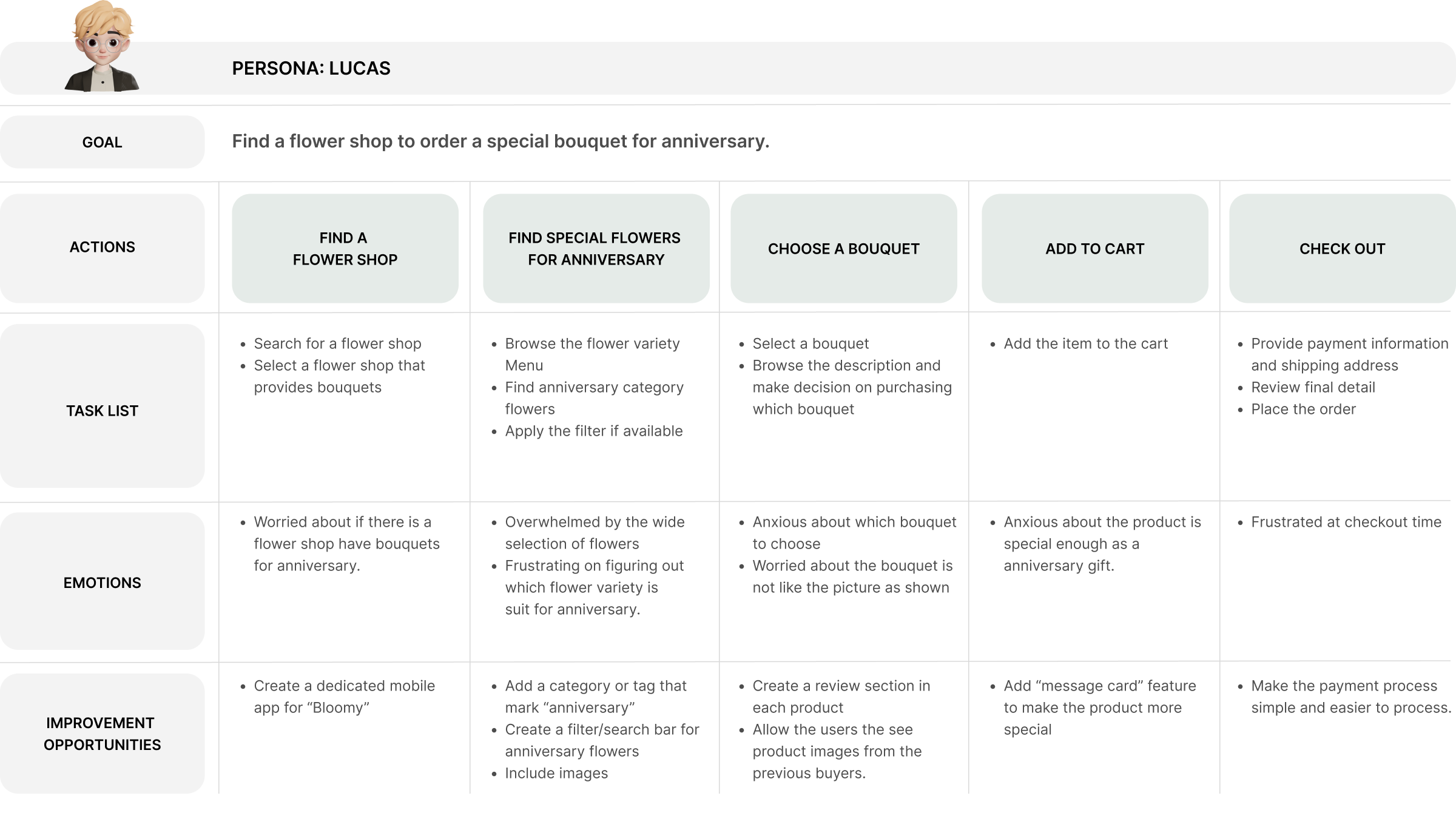
01.4 - Persona

Understand the Users
01.5 - User Journey Map
Mapping Lucas’s user journey to show the benefits for users to have access to a dedicated Bloomy florist app
02. Starting the Design
Starting the Design
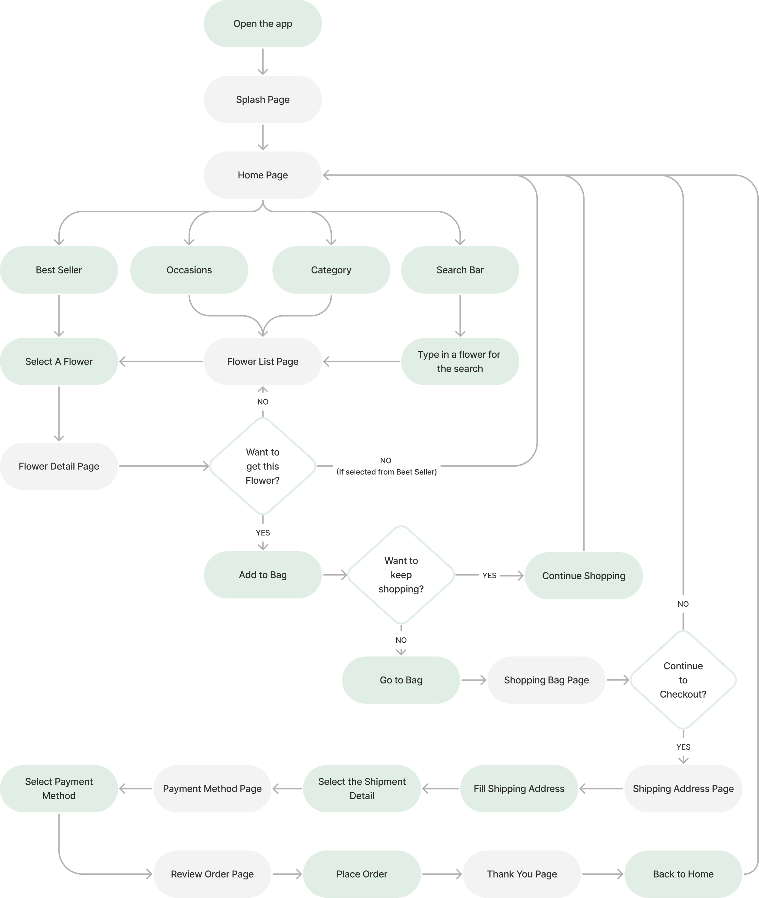
02.1 - User Flow
Starting the Design
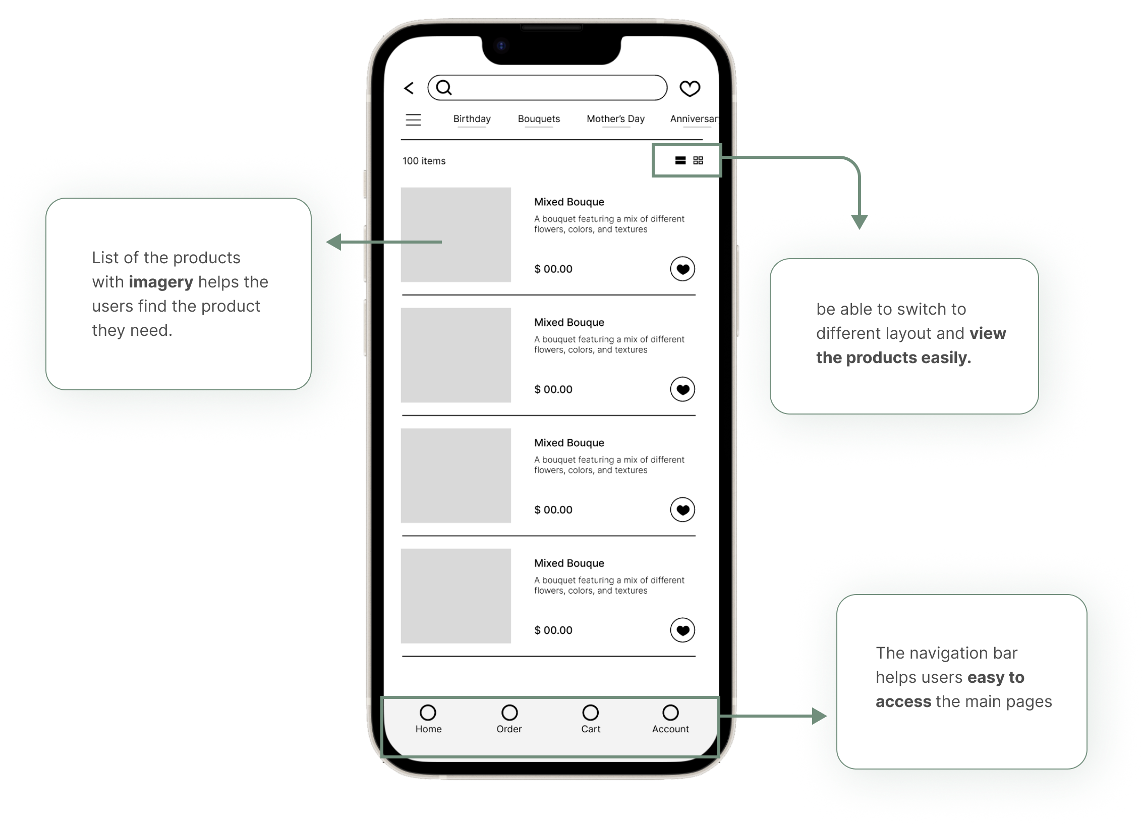
02.2 - Paper Wireframes
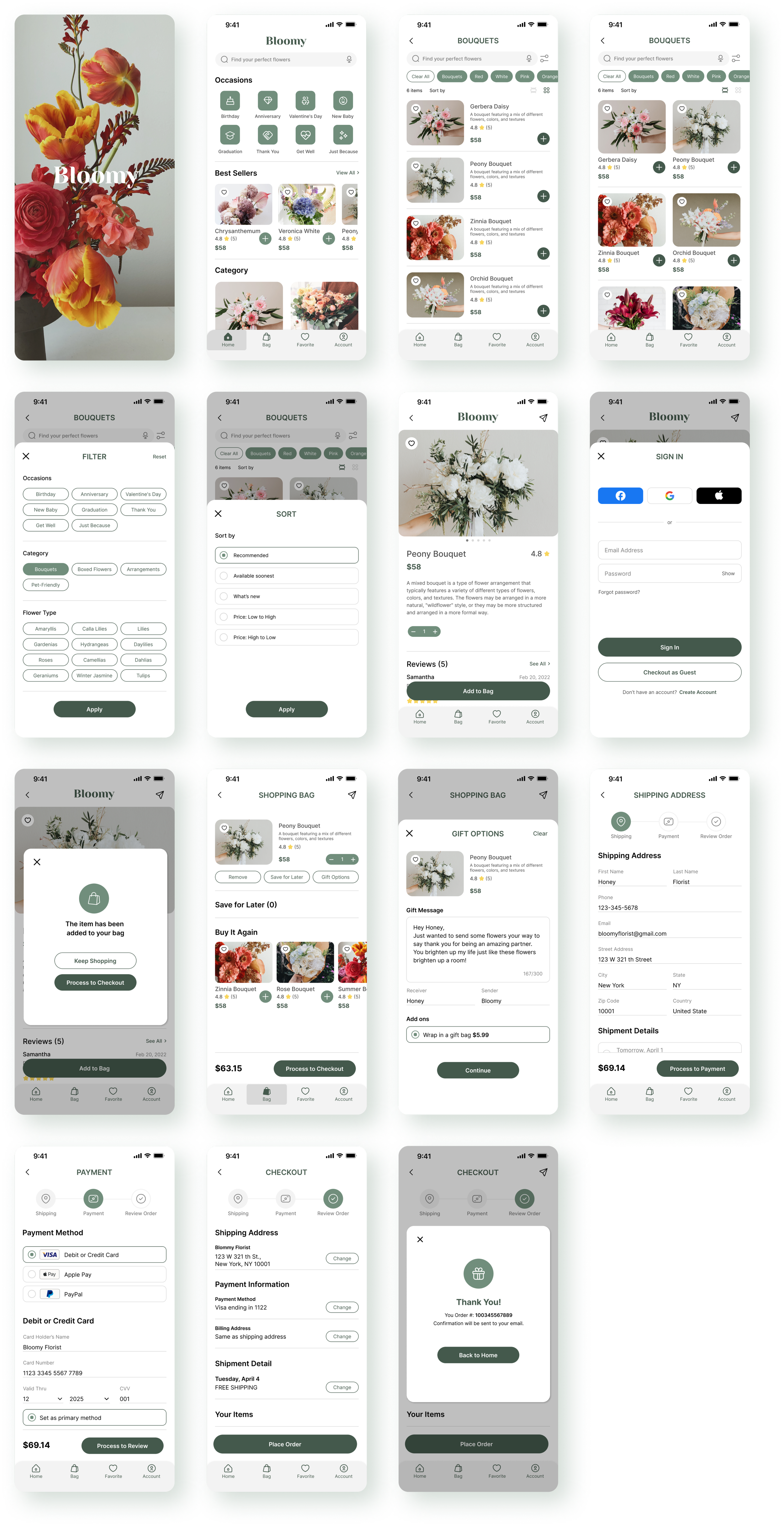
The goal of the homepage is to provide users with an easy-to-use search bar, categories, and navigation bar. Additionally, it should have some articles on flower care tips to educate users on how to care for their flowers. I brainstormed five different versions of the home screen and choose the best parts of layouts to solve the problems.


Starting the Design
02.3 - Digital Wireframes
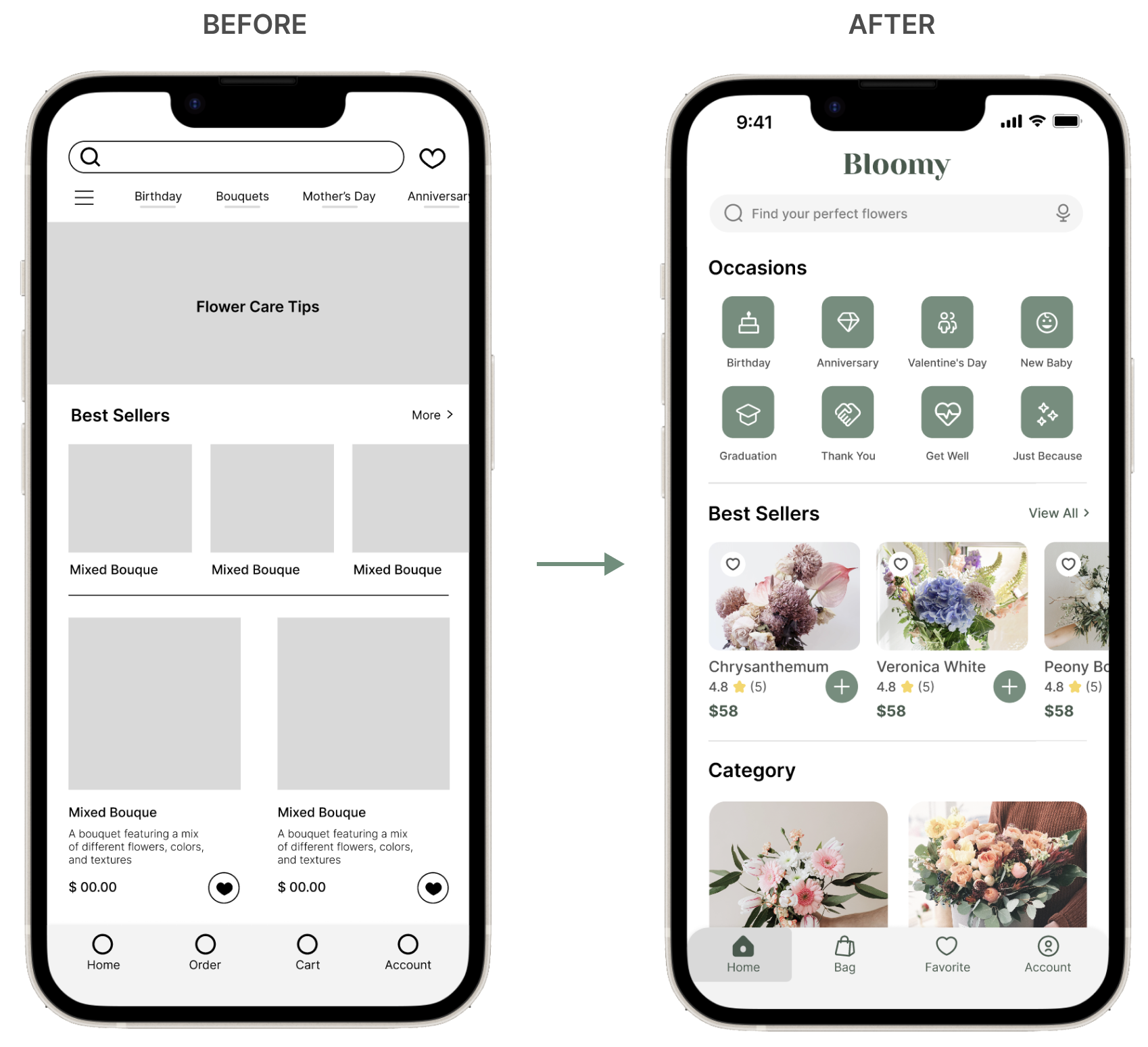
Based on the feedback and finding from the user research, I create the initial design with Occasions and Best Seller sections to allow users to find the flowers easier and faster.

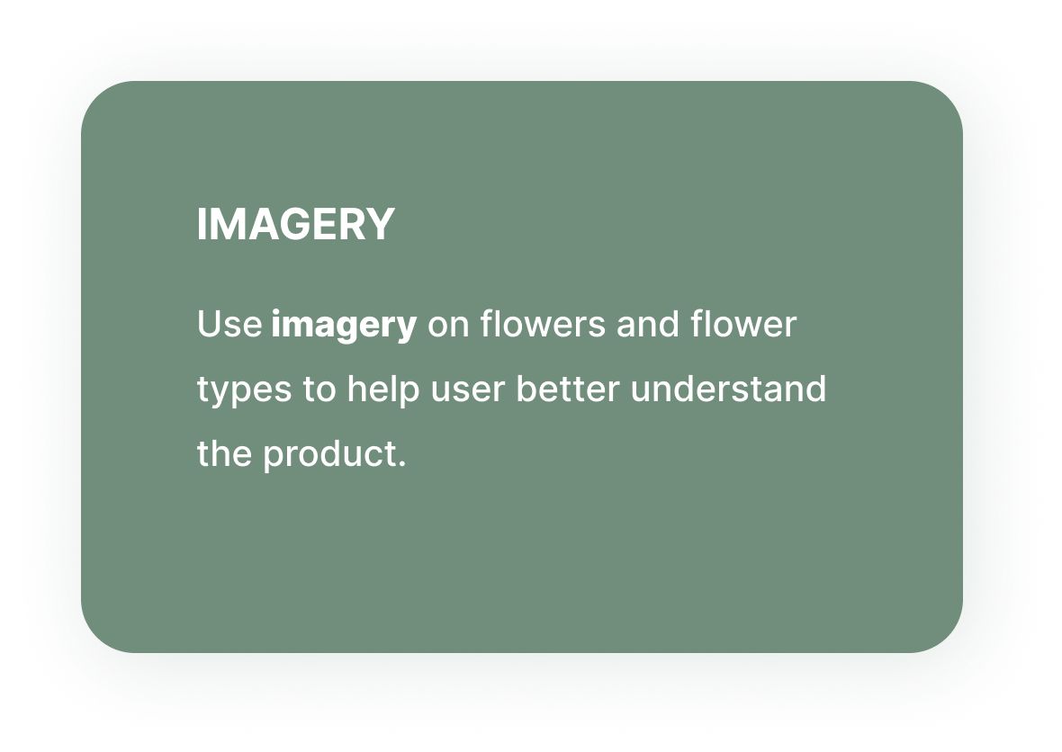
A switch button to different products layout can help the users view the products clearly and easily. Includes imagery for each product also helps the user find the product easily.
Starting the Design
02.4 - Low Fidelity Wireframes
Starting the Design
02.5 - Low-Fidelity Prototype
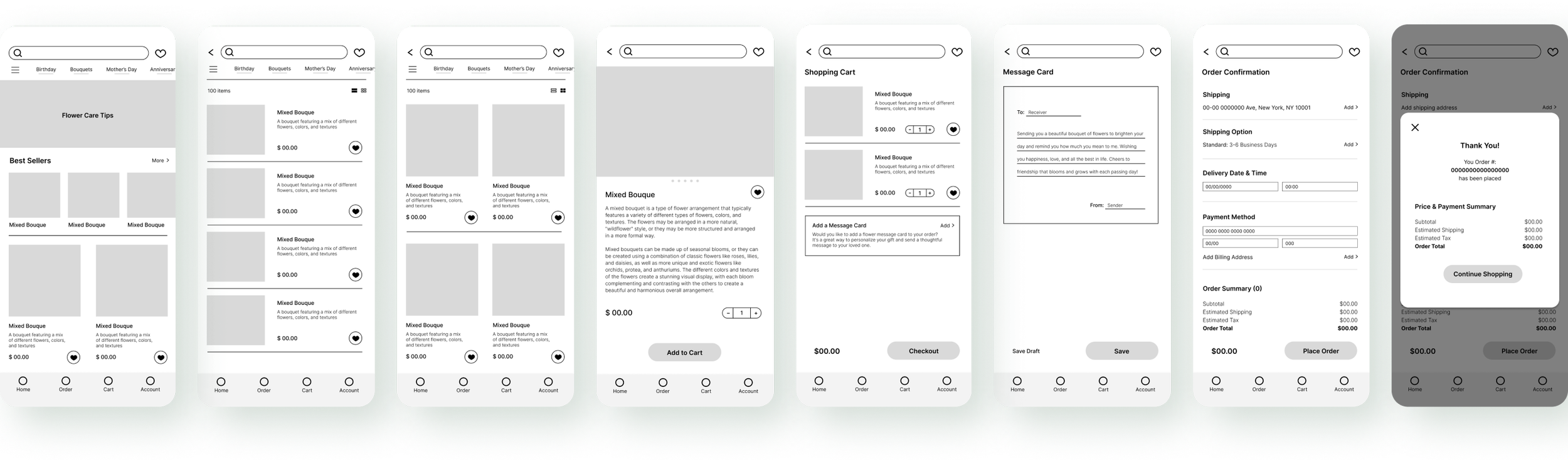
User flow: users can use the search bar or category section to easily find the flowers that they are looking for, and view the flowers details, then add to cart and review the items. Also, there is a message card can be added to the order. Finally, users can move on to check out and place the order, and receive the order number.
View Low-fi Prototype

Starting the Design
02.6 - Usability Study: Findings
I conducted two rounds of usability studies. From the first study, findings helped guide the designs from wireframes to mockups. The second study used a high-fidelity prototype and revealed what aspects of the mockups needed refining.


03. Refining the Design
Refining the Design
03.1 - First Round Usability Study
After conducting a usability study, I revised the initial design by incorporating icons in the occasion section and adding the category of the products on the bottom to help users easily find the flowers they need.
Refining the Design
03.2 - Second Round Usability Study
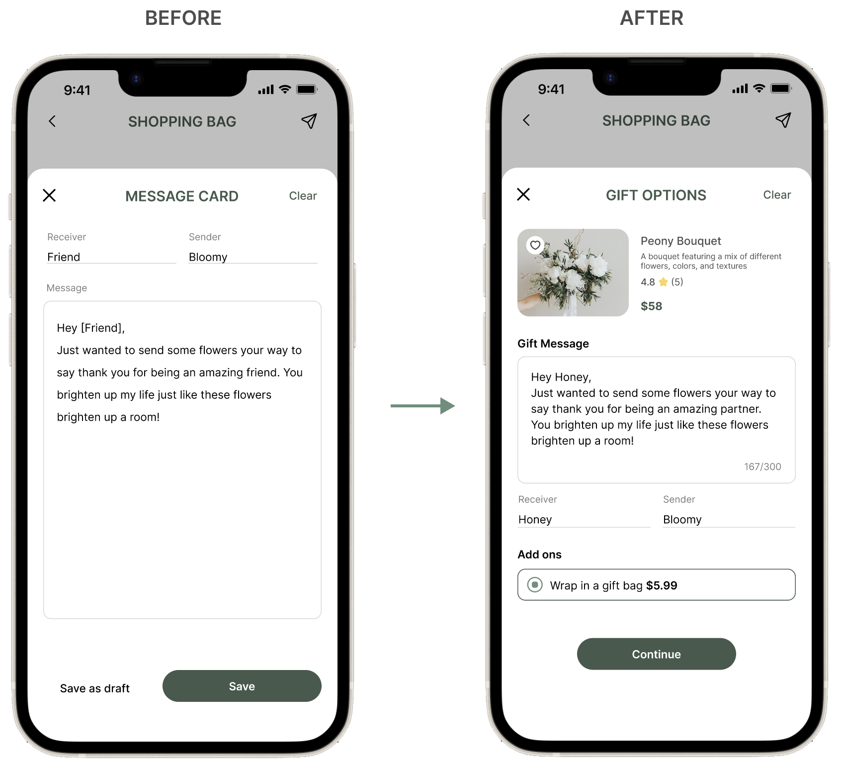
The second usability study shows that the message card page still needs more information about the specific product and gift wrapping add-ons. To address this issue, I added the product information and image at the top of the page and included a section for "add-ons" under the gift message part. These changes make the page clearer and improve the user experience, allowing users to customize a special gift.
Refining the Design
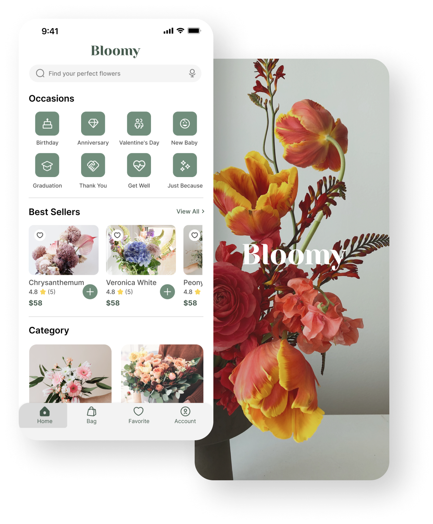
03.3 - The Final Design
Refining the Design
03.4 - High-Fidelity Prototype
The final high-fidelity prototype presented cleaner user flows for ordering flowers and checkout. It also meets user needs for quick filter the flowers that the users need as well as more customization as a gift.
Refining the Design
03.5 - Accessibility Considerations

04. Going Forward
Going Forward
04.1 - Takeaways
Impact
The app makes users feel like Bloomy really thinks about how to meet their needs.
One quote from peer feedback:
“I think it's a good app because it's simple and straightforward, so it's easy to use.”
What I learned
While designing the Bloomy App, I learned that the initial design is merely a starting point. By conducting usability studies, I gained a deeper understanding of user needs and used insights generated from the studies to iterate and improve the design.
Going Forward
04.2 - Next Step
Conduct another round of usability studies to validate whether the pain points users experienced have been effectively addressed.
Conduct more user research to determine any new areas of need.